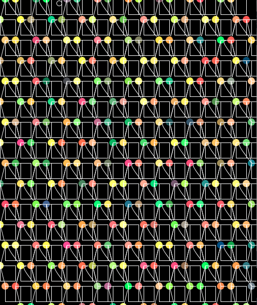
Below are 5 screen shots of my final mouse toy. For this mouse toy I have based my interactions on distorting and manipulating patterns. I have used bright colours and made it so that the colours are continuously changing colour. I think this makes my mouse toy look quite pretty. I have ended up with two main interactions. The first interaction is using the mouse pressed function. When left clicking the mouse somewhere on the screen. The circles around the area you clicked draw together to form a bunch of circles the lines also draw in to that point. The second interaction is using the mouse dragged function. When you right click and hold down the mouse and drag it around the screen. It moves the pattern around and deforms it more. I have also made it so that you can reset the pattern at anytime by using the key 'c' to clear the screen and take it back to the original pattern.
Labels
- 3D Modelling
- Creative Coding
- Drawing
- Experimenting with Materials
- Interaction Design
- Web Design
Showing posts with label Creative Coding. Show all posts
Friday, 19 October 2012
Project Three: Final Mouse Toy
Below are 5 screen shots of my final mouse toy. For this mouse toy I have based my interactions on distorting and manipulating patterns. I have used bright colours and made it so that the colours are continuously changing colour. I think this makes my mouse toy look quite pretty. I have ended up with two main interactions. The first interaction is using the mouse pressed function. When left clicking the mouse somewhere on the screen. The circles around the area you clicked draw together to form a bunch of circles the lines also draw in to that point. The second interaction is using the mouse dragged function. When you right click and hold down the mouse and drag it around the screen. It moves the pattern around and deforms it more. I have also made it so that you can reset the pattern at anytime by using the key 'c' to clear the screen and take it back to the original pattern.
Thursday, 18 October 2012
Project Three: Interaction Development
I have tried using the interaction of adding shapes again like I previously had except this time I have just made the outline of the shape and it is controlled by dragging the mouse around the screen rather than clicking. I really don't like it. It looks to busy and takes focus off the other interaction I have which is far more interesting. I think if I could get it so that the adding of shapes is used to 'erase' parts of the pattern this could look more effective and would make better use of the interaction.
Project Three: Developing The Visual
I have managed to create something that I think is visually pleasing and looks interesting. Choosing to take the fill out of the rectangles has definitely made a huge difference to the appearance of my mouse toy. I am very happy with what I have here. You can clearly see the pattern that I did have and can see that I have just developed it a little more. I think I am going to now try and add in one more interaction as I still have a bit of time left. I think I am going to revisit the interaction of adding shapes again to see what it looks like.
Project Three: Development Of New Interaction
I didn't like how the pastel yellow colour was so overpowering in my first attempt so I thought that I would try and swap it around. I have now made the circles the pastel yellow colour and the rectangles filled with a colour palette that I have specifically selected that changes randomly. I find this quite interesting but at the same time it gets quite messy. I think I am going to try and make the interaction with giving the rectangles no fill and just having them outlined so that you can identify my pattern more easily. I am getting there slowly. The code I found online has definitely been a great help.
Wednesday, 12 September 2012
Project Three: Interaction Vs Control
In todays tutorial we started looking at our new project and learning code to make a very basic animation. We looked at the difference between control and interaction. Below are some snap shots of the animations that we did together in class. I found these tutorials that we did together very helpful and also it was good to go over the basics of coding again to refresh the memory.
Practice One: Animation:
This is an example of an animation. The code that we wrote allows the square to move across the screen in a horizontal line. However we have no control of this movement.
Practice Two: Control:
This here is an example of an animation using control and interaction. As you move your mouse across the screen forwards and backwards on a horizontal line the square will follow the mouse. This here is allowing the user to have some control of the movement while interacting with the animation on the screen.
Practice Three: Interaction With Control:
Above is an example of an animation using interaction with control. Using the shapes a circle and a line, as you move your mouse around the screen in any direction and speed the two shapes will follow your movements you make with the mouse. When you watch it, it looks like the line is leading the circle abit like a dog on a leash. This animation allows the user to really interact and control the movements of the shapes.
Practice Four: Interaction With Control Two:
This here is another example similar to the one above except this time it uses two squares instead of a circle and a line. Also as you move the mouse one of the squares changes its shape.
Overall after doing the practices I feel that I have a much better understanding of what the project means when it asks for us to create an animation that uses both interaction and control.
Wednesday, 22 August 2012
Project Two: Final Pattern
Final Pattern Showing Structure To Noise:
For my final I have focused on repeating my pattern and layering it up. Suggesting noise through the layers and colour. The last image really shows noise through the build up of colour and compared to the initial image has a lot going on and is harder to understand and focus on. Overall I am very happy with this outcome. I could have easily continued and made more but the more I made the more I had to pick from and I found that they didn't necessarily look like they belonged as a set.
Tuesday, 21 August 2012
Project Two: Reflection And New Iterations
After todays tutorial I have changed a few things yet again. I went to the tutorial thinking that I was done but after showing the tutor he said that the patterns I had made looked too structured and wanted me to explore more the idea of breaking up the shape and breaking through the grid. Something else that he suggested that I changed so that I wasn't restricting myself as much was not using the pattern maker code that was available to us on the school of design site but instead write my own code. With some help I have managed to re write my code using loops. I have kept the same starting structure and then experimented with changing the value of the variables and the count of the loops. From these iterations I am going to pick 4 to create my final set. I am very happy with the outcome of the colours and hope that they print just as nice.
Sunday, 19 August 2012
Project Two: Initial Structure And Iterations
Initial Structure:
Iterations:
From adding in an offset and changing the values of the variables I have come up with few different iterations. I am not to sure which direction I want to go with yet because I quite like them all. At the moment I am just experimenting with making iterations and hopefully on tuesday with the help of the tutors I will be able to decide on a direction and pick my final four iterations to make the series. Overall I really like the colour pallet that I have used and I think it works well. I may change the shade of the green slightly but I can experiment with this later. Something else I want to consider for the next iterations is changing the stroke weight and also use fill to create a different effect and show noise as well.
Friday, 17 August 2012
Project Two: Practicing Pattern Making
Pattern One: Black And White
Pattern Two: Introducing Colour
Pattern Three: Just Having A coloured Outline
Pattern Four: Triangles
Pattern Five: Trying Out Patterns Within Patterns
Thursday, 9 August 2012
Project Two: Structure And Noise
In todays lecture we went over the project and were shown some various images by Anton Stankonwski and we had to say whether we thought they portrayed structure or noise more. The point of the exercise was to get us thinking about what structure and noise means and how it is visually shown.
We got asked to write down our own meanings for each of the words. As well as this I also looked up the official definition of them. I think structure and noise mean the following.
Structure: Repetiton, alignment of elemenets, something that we can follow and recognise.
Noise: Something we can't make sense of, more colours and more random.
The dictionary meaning of these words are as followed.
Structure: Mode of building. construction, organisation, arrangement of parts, elements or constituents.
Noise: A nonharmonious or discordant group of sounds.
Below are two examples of Stankonwski's works which I really like.
Anton Stankonwski: Form Fiden
I really like the image on left because I think it is a really nice example of how you can use colours to emphasis an idea and composition. It is very structured but the more you look at it the more things you see which begins to make it seem quite noisy.
I like the image on the right because I think it is a nice contrast to the image on the left. Using just line instead of block colour creates a completely different look. I think the composition of lines make the image look noisy but at the same time the grid is quite obvious giving the image some overall structure.
Subscribe to:
Posts (Atom)